In the design world typically small mom and pop shops want to puff out their chest to appear larger. Conversely large corporations want to humbly play a diminutive role to give off a small batch, wholesome persona.
I find magnifying something to make it appear larger is easier to pull off than trying to look more homegrown. A homegrown look can sometimes require a slightly amateur feel. The challenge and paradox becomes: how do you create the illusion of not knowing when you know. It makes me think of a Milton Glaser quote about breaking the rules. If you know the rules and you break them with intent, purpose and reasoning then it’s considered innovative. If you break the rules without knowing then it’s sloppy.
Recently I took on a project to create beer labels for a craft brewery. The craft beer industry is saturated with Buddy Holly glasses, beards, fixie bikes and skinny jeans. The consumer is well versed on hops, aging, fermentation, filtering and an encyclopedic knowledge of every type of beer imaginable. Anheuser-Busch is viewed as the evil empire and the design objective is to distance yourself as far away from Budweiser as possible. The craft brewers take great pride in the ingredients, process and artistry of their beers.
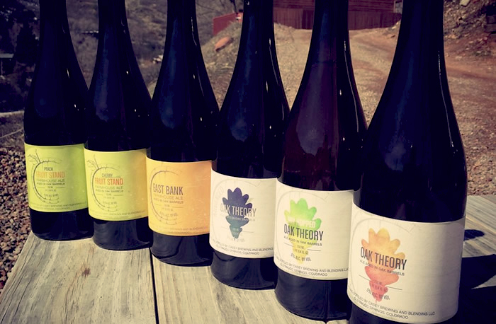
I believe that authenticity is an important aspects of communicating through design and figuring out a way to do this while standing out from the competition is often the biggest challenge. One of the unique aspects of my client, Casey Brewing and Blending, is their commitment to local ingredients and bringing back old-world brewing techniques. I wanted to visually communicate this back to the basics style.

In doing a competitive analysis I found that many of the craft beer labels make an effort to look odd and unconventional. They rebel against the ideals of large market beers in mocking, cagey fashion sometimes resulting in something quirkishly humorous or intentionally amateur. Rather than follow this trend I wanted to find a space that would stand out from the odd and unconventional and communicate a message of high end artisan. I wanted clean and calming as juxtaposition to the other labels. I looked to wine labels for inspiration. I did this for three reasons: 1 The bottles that would be used for this beer would be 1.5 L or 750 ML which is the same size as wine bottles. 2 There is an existing perception in the marketplace that associates wine with an artisan, crafted process. I wanted to leverage this. 3 The price point for this beer would be similar to the price point of a bottle of wine. I wanted to shift the consumers paradigm to think of a bottle of beer in the same price category as wine.
The solution: Keep it simple. “The ability to simplify means to remove the unnecessary so that the necessary can speak” Hans Hofmann.

I saw an opportunity to simplify the design and really dial things back in order to differentiate from the busy, convoluted labels it would compete against on the shelf. This simplified, bold look also tied into the old-world brewing techniques they utilize. I believe a simple statement, when done correctly is a bold one.
In communicating the rustic mountain location of the brewery and the unique, unfiltered process of the beer I wanted the paper to have a rough texture and the graphics to have a subtle, weathered look. I felt a tactile label would encourage the consumer to want to touch and ultimately pick up the bottle to inspect further. Another consideration when creating the first piece in a system is to make sure it has legs. This means you can foresee iterations of the piece and that you’re not painting yourself into a corner. I wanted to make sure we would be able to branch off the original piece so proceeding labels would relate to the original as an obvious family. We selected the symbol of the logo to serve as the common graphic thread which also performed double duty in reinforcing the brand.
To date Casey Brewing and Blending has over 30 beers. The business continues to thrive and Troy Casey continues to craft excellence.


Leave a Reply