A Fresh Look On An Old Classic
If you go into any tool room or shed most likely you will find some version of the clamp lamp. This product has been around for generations and it’s design has not changed much in the past 40 years.
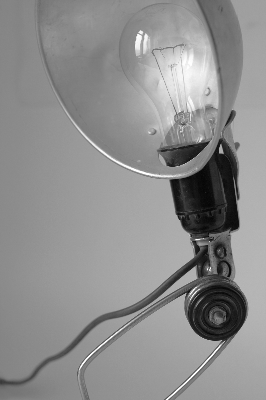
It’s aluminum shroud, which always looked like someone had a vendetta against it never provided much protection for the light bulb. I remember every time I grabbed the clamp lamp from my dad’s tool room it was in need of a fresh bulb. In the construction world filled with hearty handshakes the wire clamp was the equivalence of a dead fish handshake. It caused the lamp to slowly droop down making it appear like the lamp was falling asleep on the job.
Find the Problems
From a safety standpoint it was even more disastrous. Because of the weak clamp the light would often fall off what it was clamped to and land face down. Some estimates stated that these lights were responsible for just under 50% of construction fires. Yet this product continued to sell volumes at the big box retail hardware stores each year. As a designer I saw a perfect opportunity to improve on this classic that had somehow pick up a get out of jail free card.
In setting out to redesign the clamp lamp I saw the need to be similar yet different. I didn’t want to make a product that ventured so far from the norm of the well established clamp lamp that it was unrecognizable. In the consumers mind I wanted to leverage the warm glow of familiarity with the excitement of something new and better. I focused on 3 main features to improve upon.
01. Aluminum Shroud
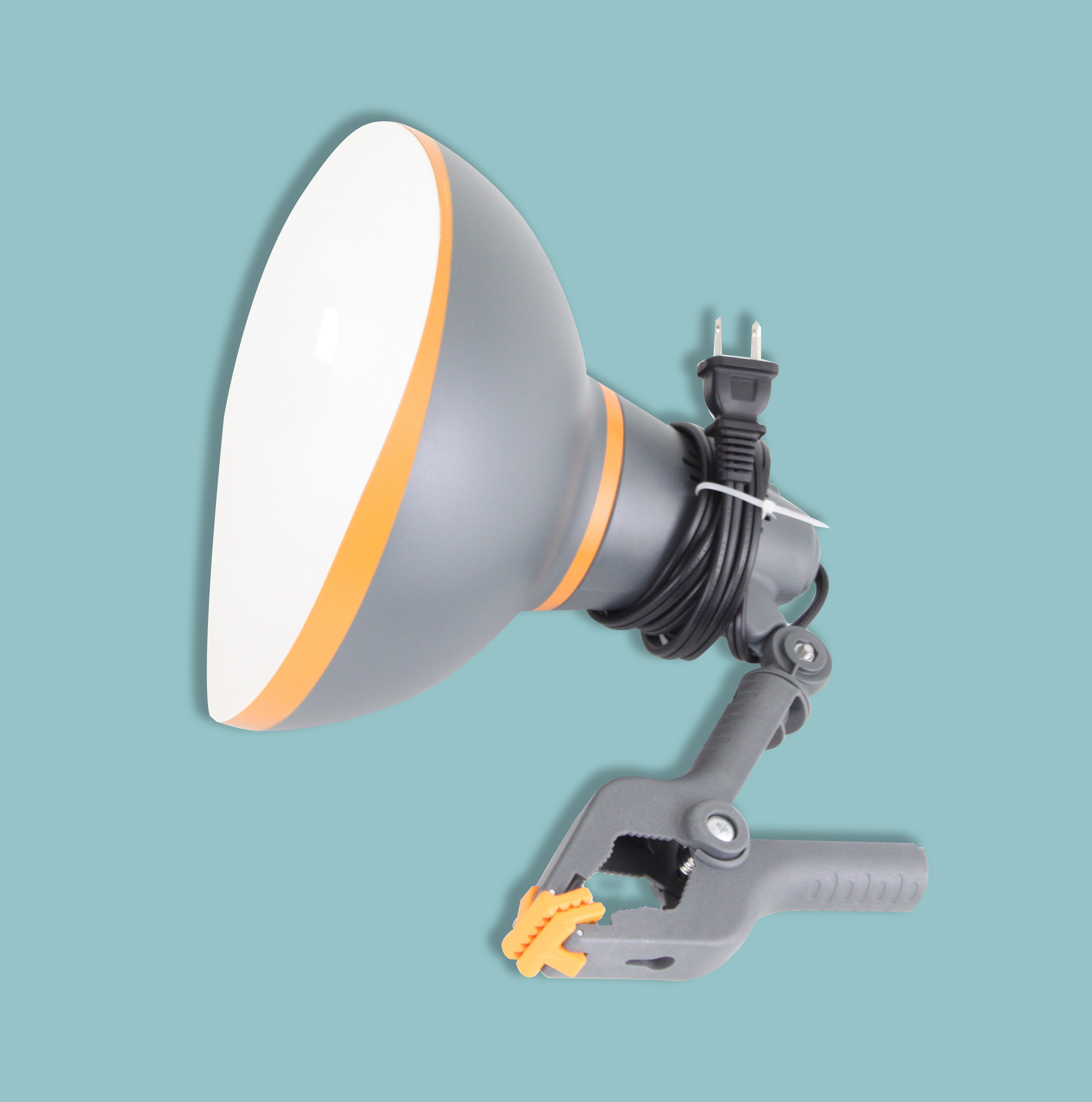
Aluminum was used because it was a good reflector the problem was because it’s a soft metal it would dent very easily and as a result looked like it just went 12 rounds after a short time on the job. With modern plastics we were able to create the shroud out of polycarbonate which is dent resistant and virtually indestructible. It is also much lighter than aluminum reducing the weight the clamp has to hold. I wanted to enhance the reflective aspect of the aluminum shroud however, so we lined the inside of the shroud with a white gloss finish. This helped increase the brightness dramatically.
In setting out to redesign the clamp lamp I saw the need to be similar yet different. I didn’t want to make a product that ventured so far from the norm of the well established clamp lamp that it was unrecognizable. In the consumers mind I wanted to leverage the warm glow of familiarity with the excitement of something new and better. I focused on 3 main features to improve upon.
02. Shroud Design
The safety hazard of the clamp lamp was due in part to its shroud design. When it fell to the floor the shroud would rest flat causing the heat to be trapped, worst case resulting in fire. We accounted for this by incorporating a slight wave to the rim of the shroud creating a space for ventilation if it were to fall flat.
03. The cheesy clamp
We used the same material for the clamp as we did the shroud for maximum durability. We strengthened the clamp considerably and applied rubber grips on the teeth of the clamp. We enabled the clamp to rotate a full 360 degrees for maximum flexibly. We then added a lock nut to allow the user to fix the clamp once it is in the desired position. We include a nail hole on one of the clamp grips to allow the user to hang the lamp from a nail as an alternative way to position the lamp.
As a side note I initially wanted to integrate an LED bulb into the lamp. I knew from a safety and energy efficiency standpoint this would be a good idea. Integrating an LED created a couple issues. First it did not allow the consumer the freedom to put in the type of bulb they wanted, be it incandescent or LED. Second it bumped the price point up considerably. In the consumers mind there was a specific price point that a clamp lamp should fall into. By making these improvements we were already pushing the comfort level of the consumer and so opted to leave out the integrated LED.
Packaging
The previous packaging and displays for the clamp lamp had been lack luster at best. Basically a large cardboard bin with the product packed in like a giant grab bag. While this may convey a certain ruggedness to the product, I believe it did more to commoditized the product in the consumers’ eyes. In order to shift the consumers’ perception of the product to a slightly higher price point, it needed to be displayed with more prestige and better organization.
Telling The Story
The packaging in the past had been very minimal. This was primarily because the clamp lamp has been around for so long and required no explanation. In order to distance the new product from the previous I wanted the packaging to be a departure from the previous. The packaging of a product is crucial, it is many times the initial exposure a potential customer has to the product and it needs to clearly communicate the product story.
In telling the story of the product there were three things I wanted to highlight which were at the top of the information hierarchy.
Callouts
1: The Polycarbonate material used for the shroud. We highlighted this graphically by making POLYCARBONATE part of the name and displayed it prominently at the top of the package. As a rule of thumb I believe if you allow the consumer to see and touch the product it helps tell the story. We opened the front of the packaging and created a window on the side to display both sides of the polycarbonate shroud.
2: The Clamp: Animals have long been used as a vehicle to generate an emotional response to an otherwise emotionless purchase. They are also excellent in signifying traits such as strength, wisdom, memory. After considerable research we branded our clamp The Hippo Clamp. We decided on the hippo because it symbolizes strength and is known for having one of the strongest bites. Our goal was to add personality to an otherwise austere product. We took it a step further by giving the light a tagline. The lite with bite. Again this was done to differentiate and make the product more memorable. The packaging was designed so the consumer could touch and see first hand how the clamp worked.
3: We wanted a way to call out the re-design. We created a badge resembling a quality seal to alert the consumer of the design upgrades.