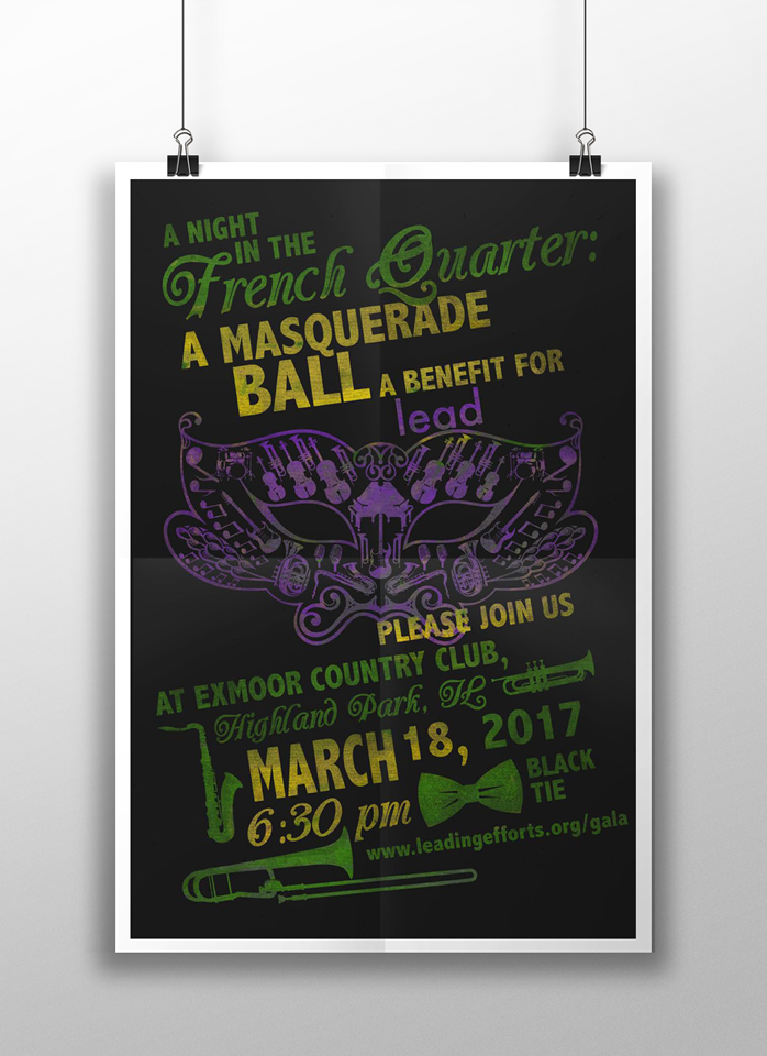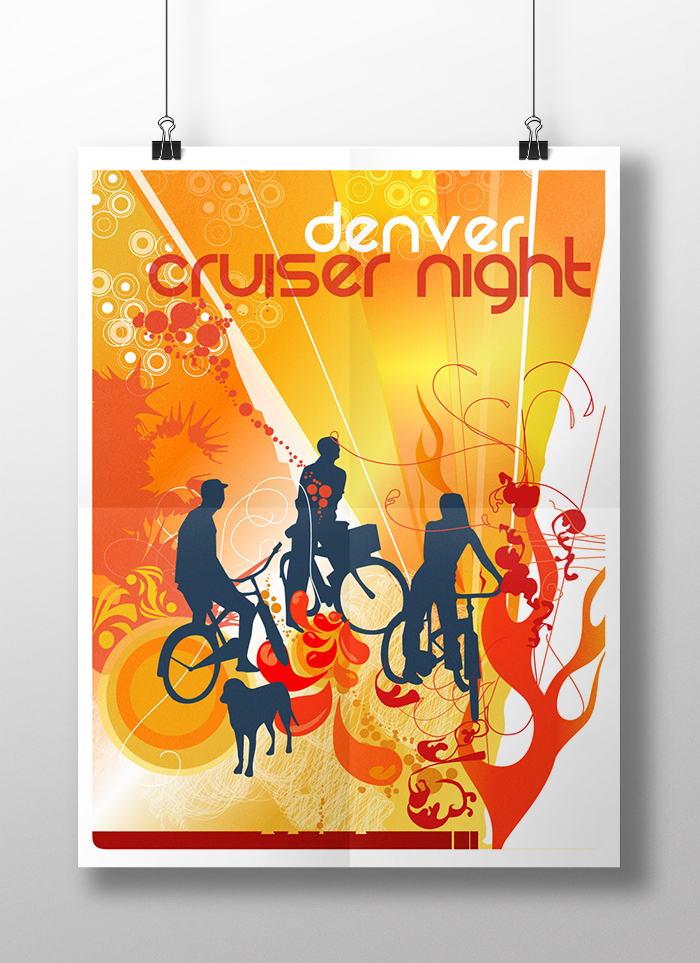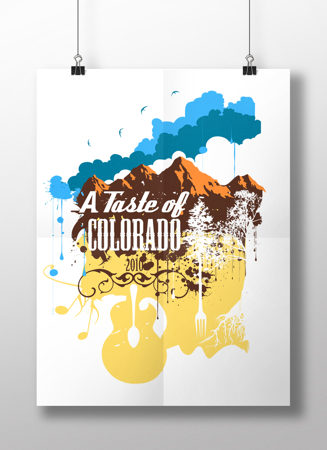
In an effort to create meaningful and challenging imagery, I never want to lose sight of the typography that accompanies the art. The success of a poster hinges on the type choices that are made taking into account the readability and audience. Many posters are intended as merchandise, as the Taste of Colorado was, opposed to items to promote a show before it happens. It is fun to take chances, but typography remains the most important aspect of poster art.